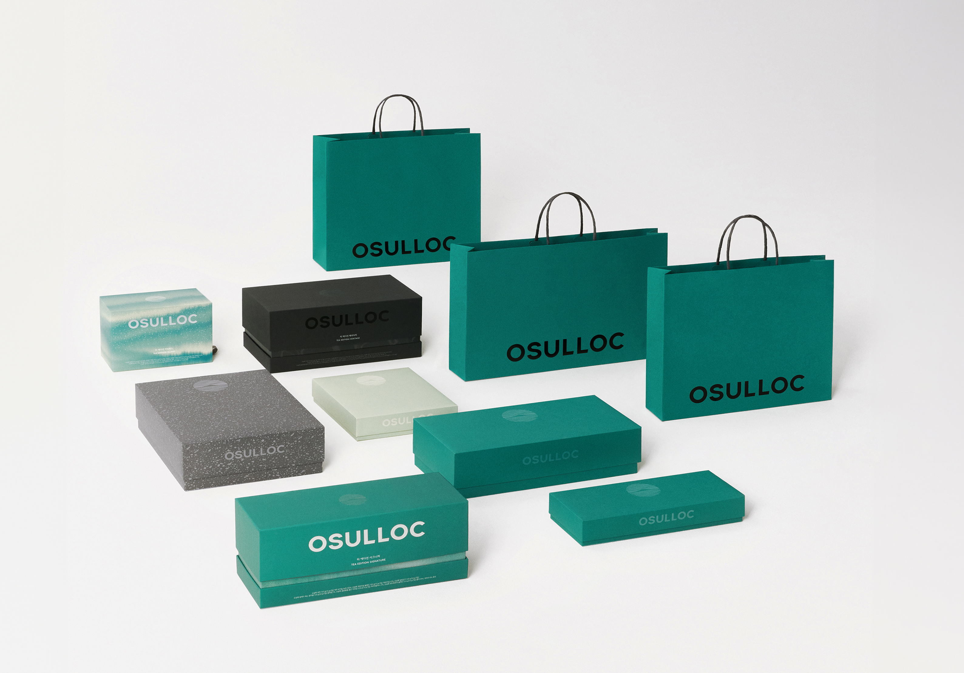
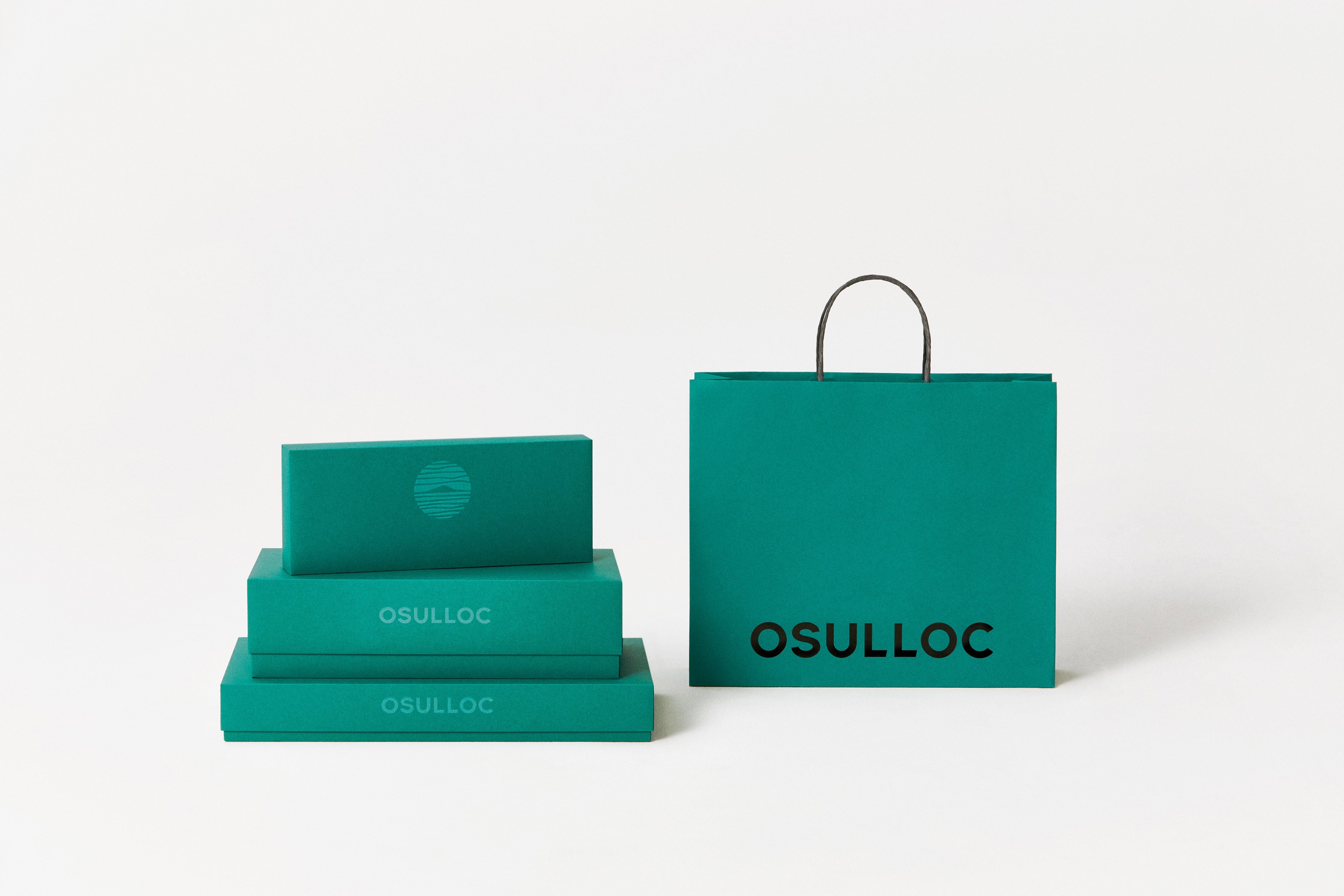
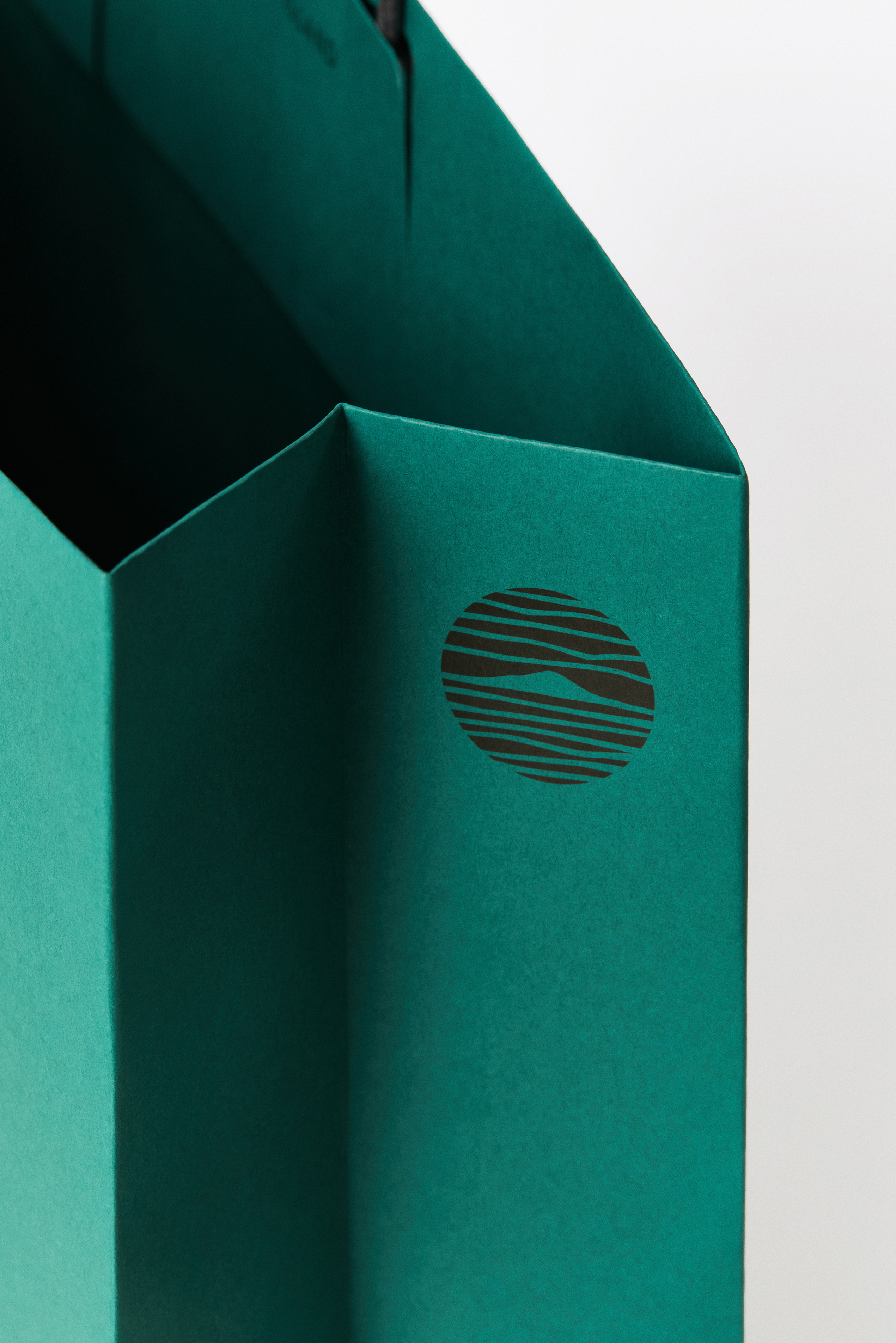
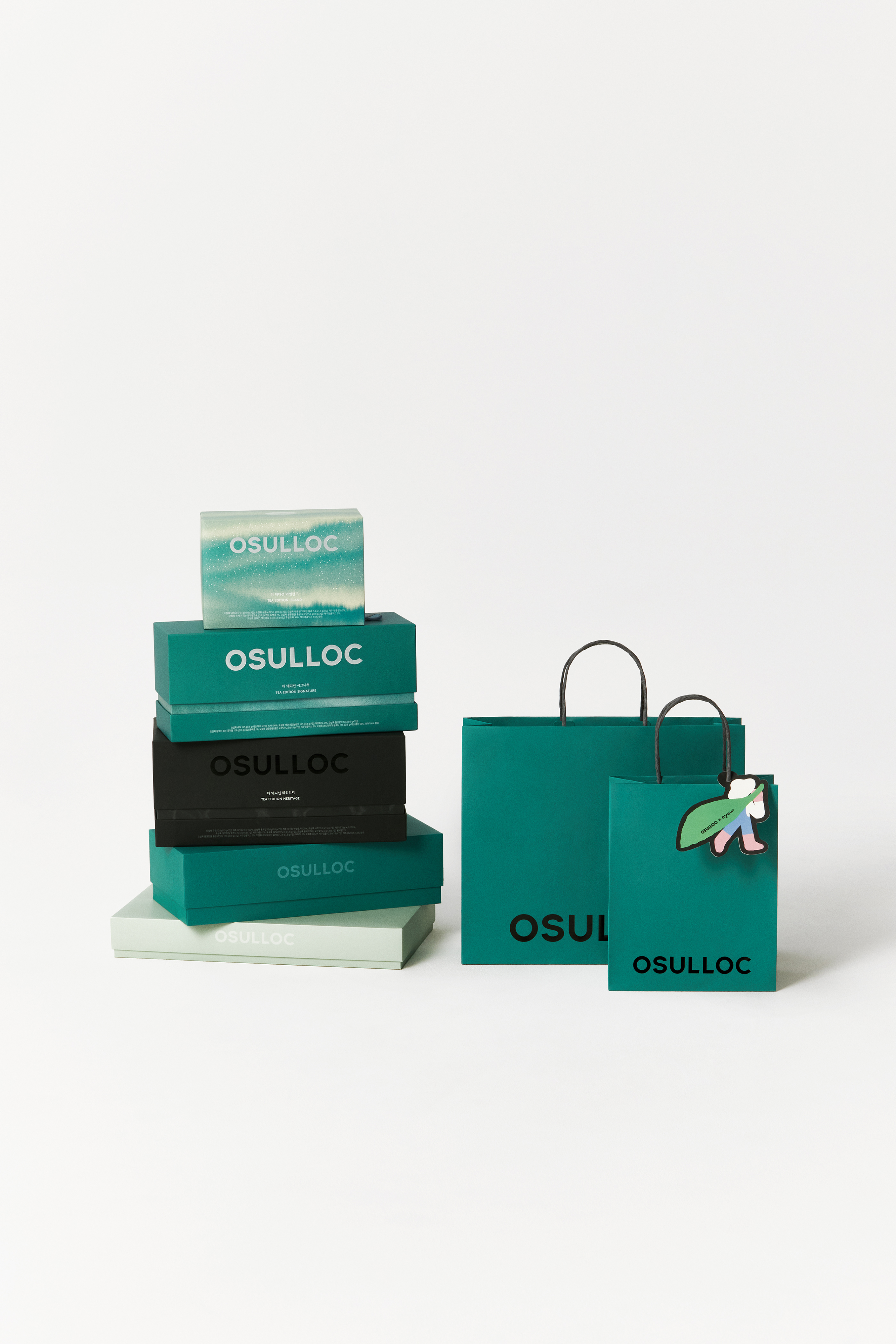
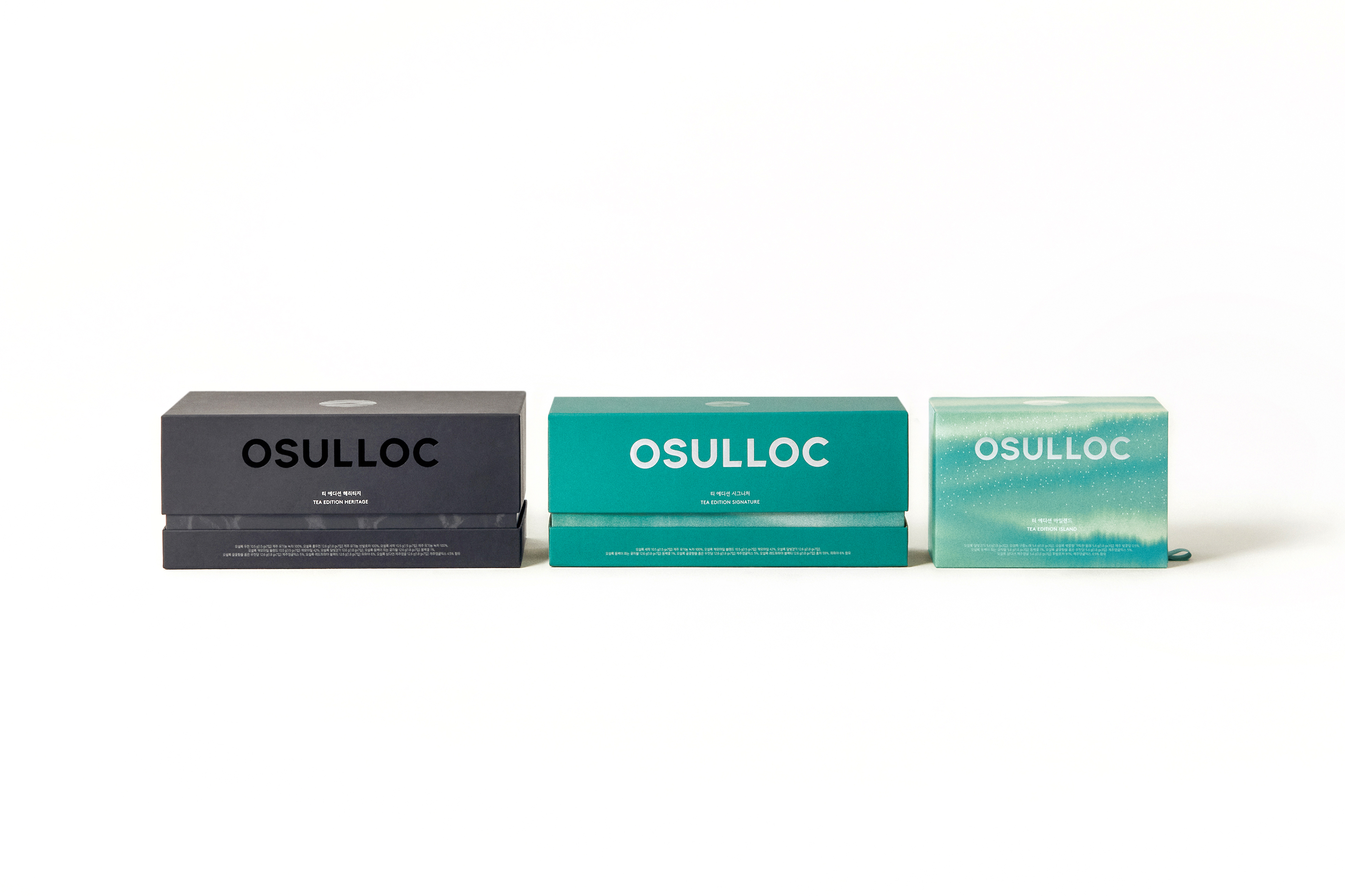
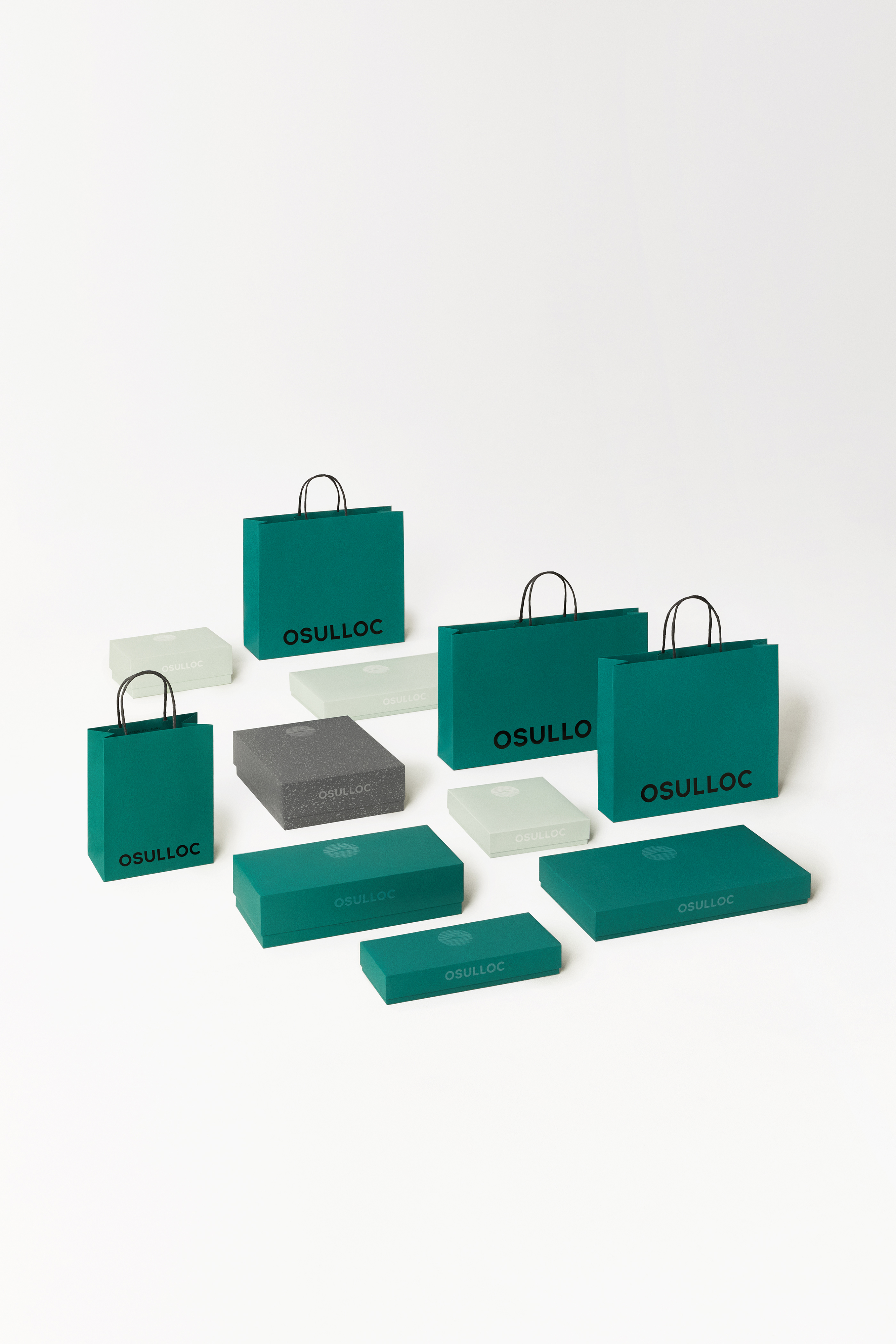
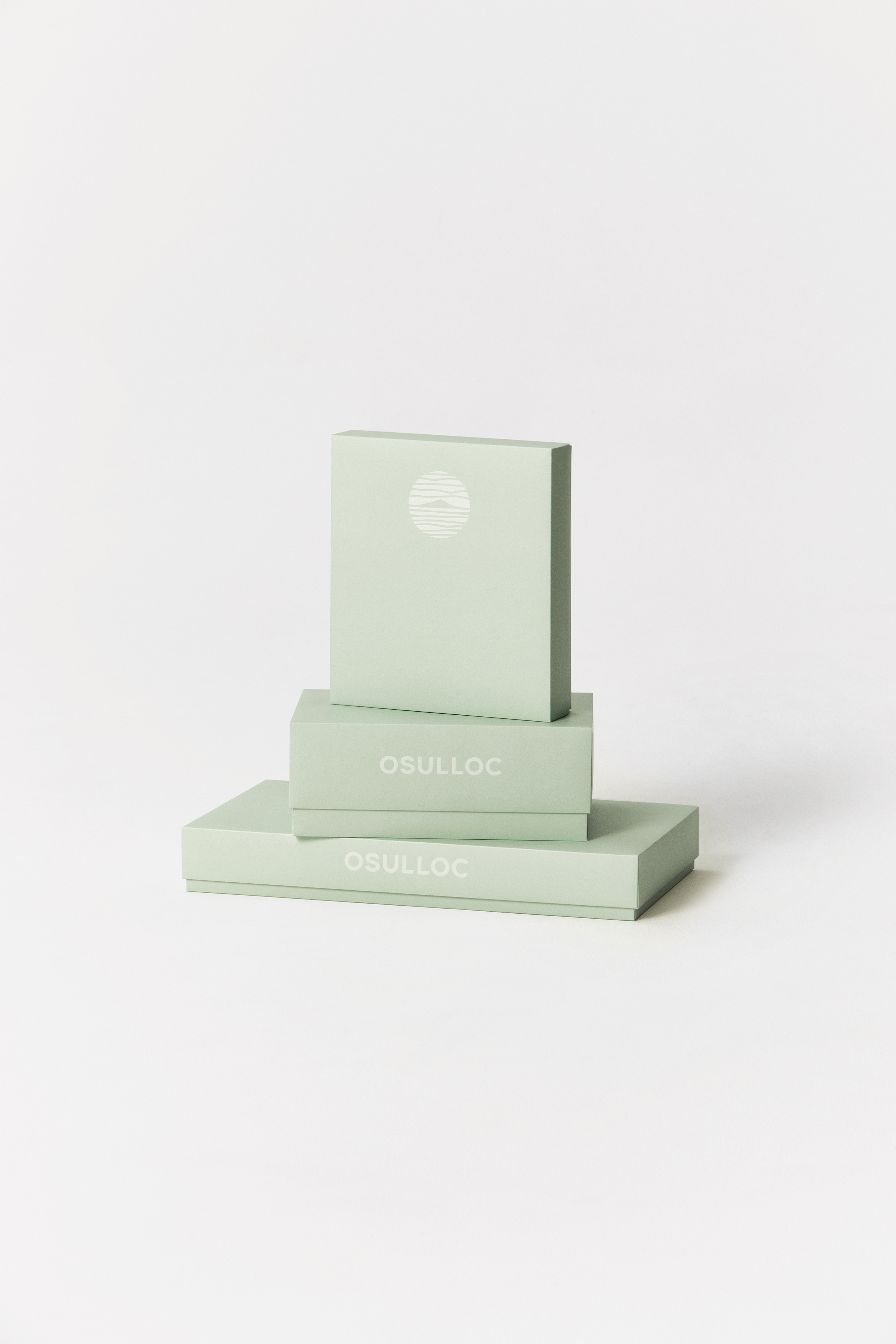
C Osulloc M Signage, Branding, Package Y 2024 MYKC redefined OSULLOC’s brand identity to support its growth as a global tea brand rooted in Jeju heritage. The renewed identity draws on the philosophy of ‘Tea-scape’ (茶境), offering a modern interpretation of Korean tea culture across generations and cultures. The new system features an English wordmark and a standalone symbol for flexible application. Teal Green and Gray, inspired by Jeju’s tea fields and volcanic landscape, form the core color palette. Custom patterns echo natural textures, reinforcing a serene and immersive tea experience. This renewal aims to clarify OSULLOC’s identity and expand its global presence.Photo: Courtesy of OSULLOC .